This project is a rebrand of the Science History Institute, a museum in Philadelphia with scientific equipment on display. The equipment and information at the museum ranges from tools used in chemistry to early technologocial inventions.
Science History Institute
Science History Institute
Branding
I decided to rename the Institute due to the large amount of chemistry tools and information on display, also because the new acronym is now "SCI" as opposed to "SHI." The dots are inspired by an early braille machine on display. The group of six dots to the left of "S," "C" and "I" represent those letters in braille, and by shifting the rows it appears as an abstracted form of DNA and particles.
Posters
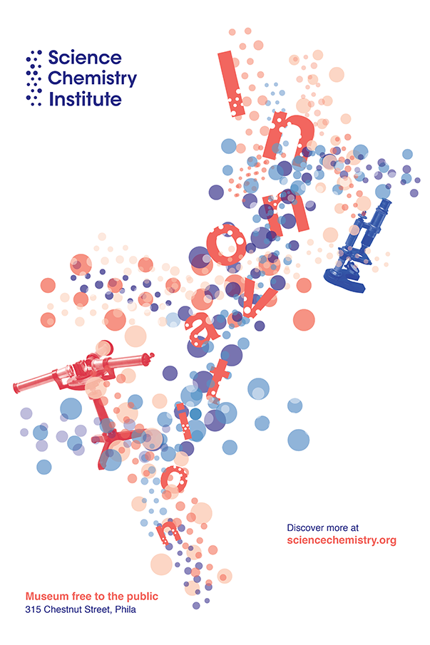
The first poster is a general branded poster that is meant to provide insight about the museum to viewers. In this case, it highlights instruments that contributed to major scientific innovations on display. The dot texture is pulled from the logo and is repeated, scaled and varies in color.
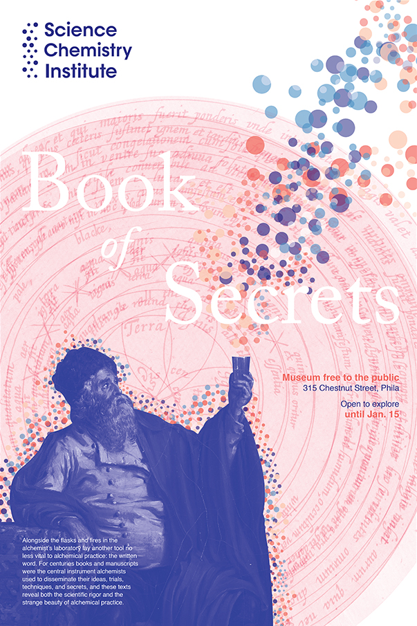
The second poster is for a limited exhibition that centered around the mysteries of alchemy. The design utilizes curated images from the exhibit including a master painting of an alchemist and a diagram from an alchemists' sketch book.
Business Cards
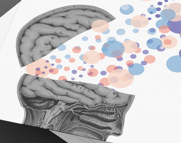
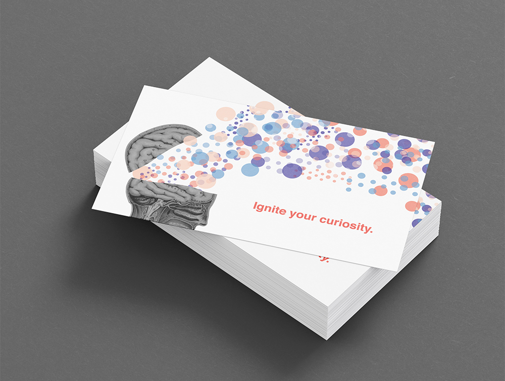
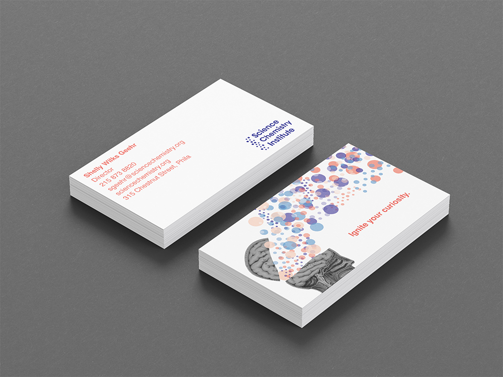
The front of the new business cards feature an illustration of the human head from the online digital archives of the Institute. Following the dots to the new slogan leads you to the back of the card where you find the logo in the bottom right corner with the contact information in the opposite corner.
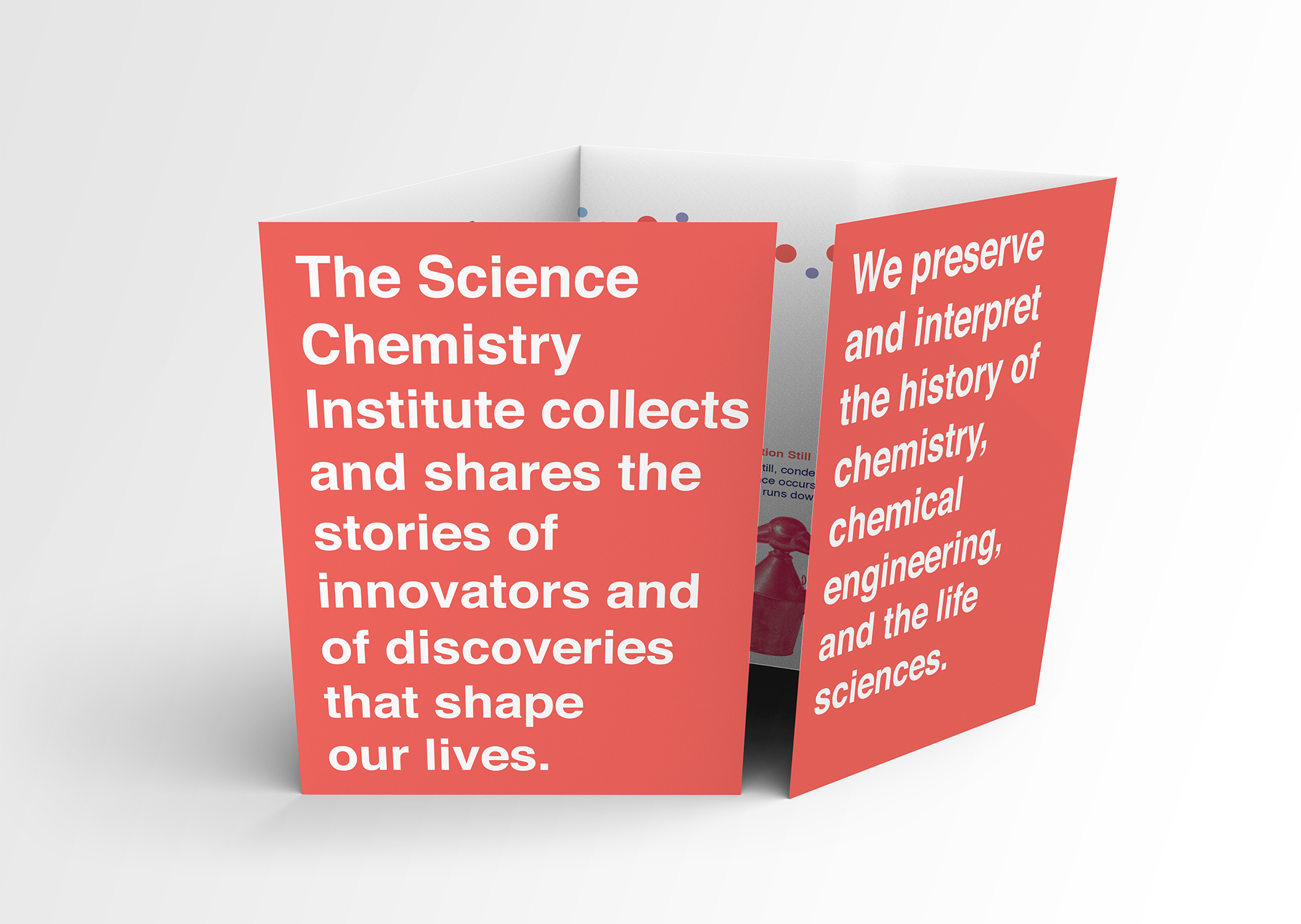
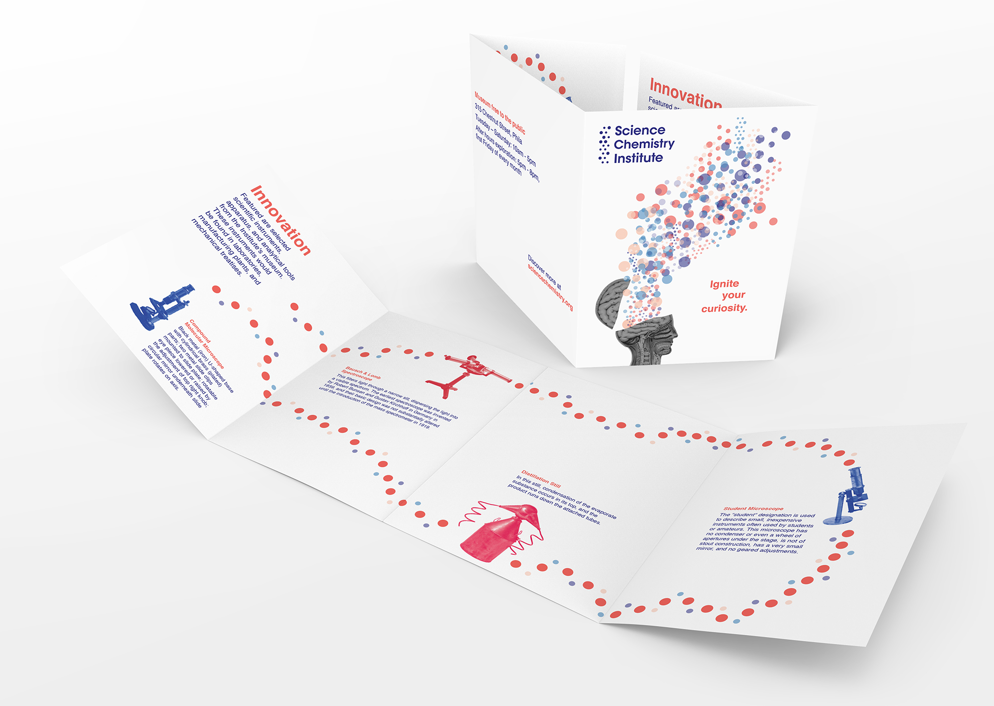
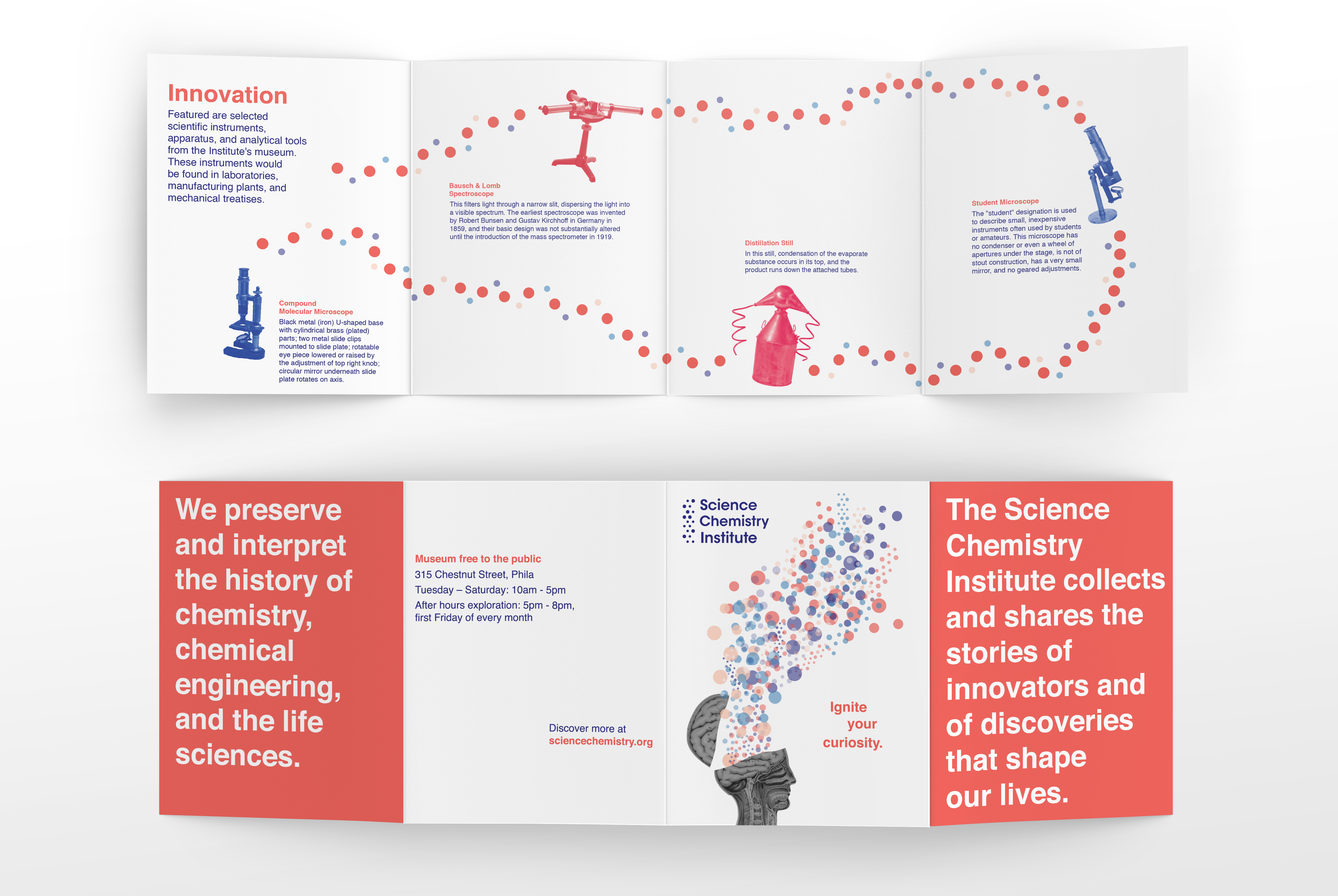
Brochure
The brochure is a double gate fold featuring the brand message on the two inside folds. Opening the folds reveals information about instruments on display.