Horizon Institute for Public Service is a non-profit organization that helps the US government find the next generation of upcoming technology policy talent. Their program, the Horizon Fellowship, works to provide talented students and professionals with access to resources and mentorship they need to begin their careers in public service, specifically in areas of artificial intelligence and biosecurity.
Horizon Institute for Public Service
Horizon Institute for Public Service
Web Design
The main purpose of this project was to increase the amount of applications to join the Fellowship (essentially increase the CVR of the page). One of the main challenges of this task was that none of the copy could change, with the exception of a section I added because I felt it could help convince users to apply. Using UX best practices, I found areas for improvement. The result was a large increase in CVR, proven by doing an A/B test with the old design. Their website is built on Wix, however I implemented custom code for several elements that are not available in the Wix page builder.
Become a Fellow - Achieved a 13% increase in CVR
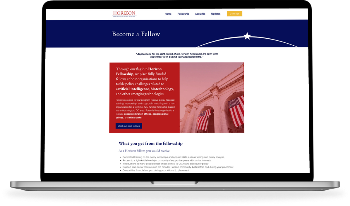
There were some concerns with the hero section, namely the fact that the only CTA button on the whole page went to a different page on their site instead of the application page (it went to their "Meet the Fellows" page). In my redesign, the button now goes to the application page, along with streamlining the layout so it is shorter in height and using an image of their actual Fellows to create a more personable experience for users. I maintained their "horizon star" element and used it as a transition into the beginning copy.
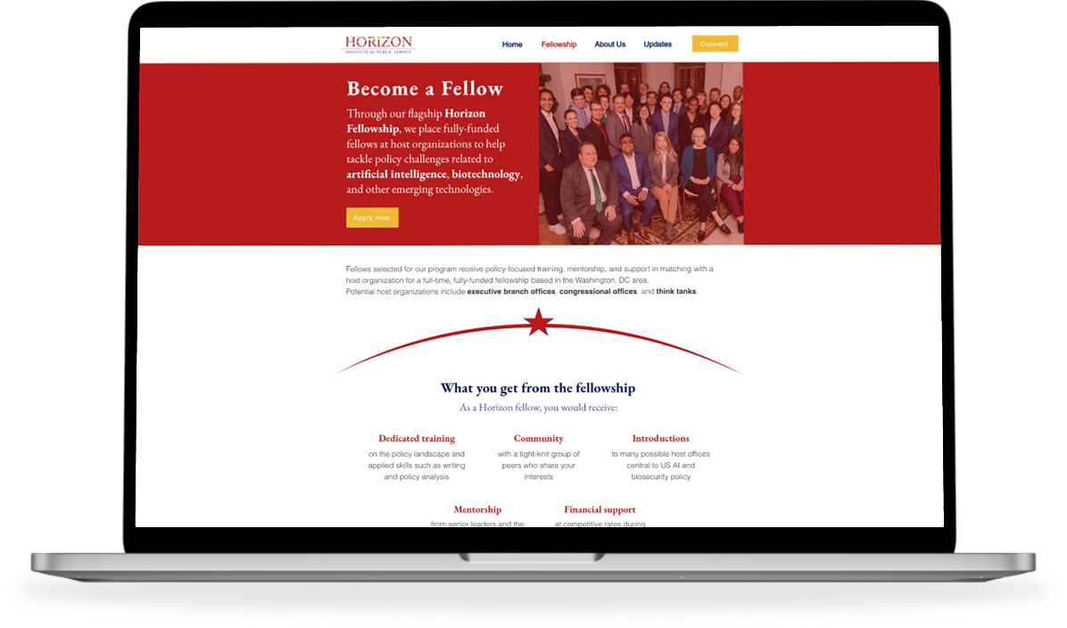
"What you get from the fellowship" is a crucial segment of the page as it provides key reasons for applying. In this section, I pulled the information out of the bulleted list to make it easier and quicker to read. The typographic treatment also creates an emphasis on the information and a CTA button was added below the last two.
Further down the page, I added a section highlighting some previous Horizon Fellows. This achieved two things: highlight the success of those that used the program as a testimonial to the Fellowship and easy access to see more previous fellows on a different page.
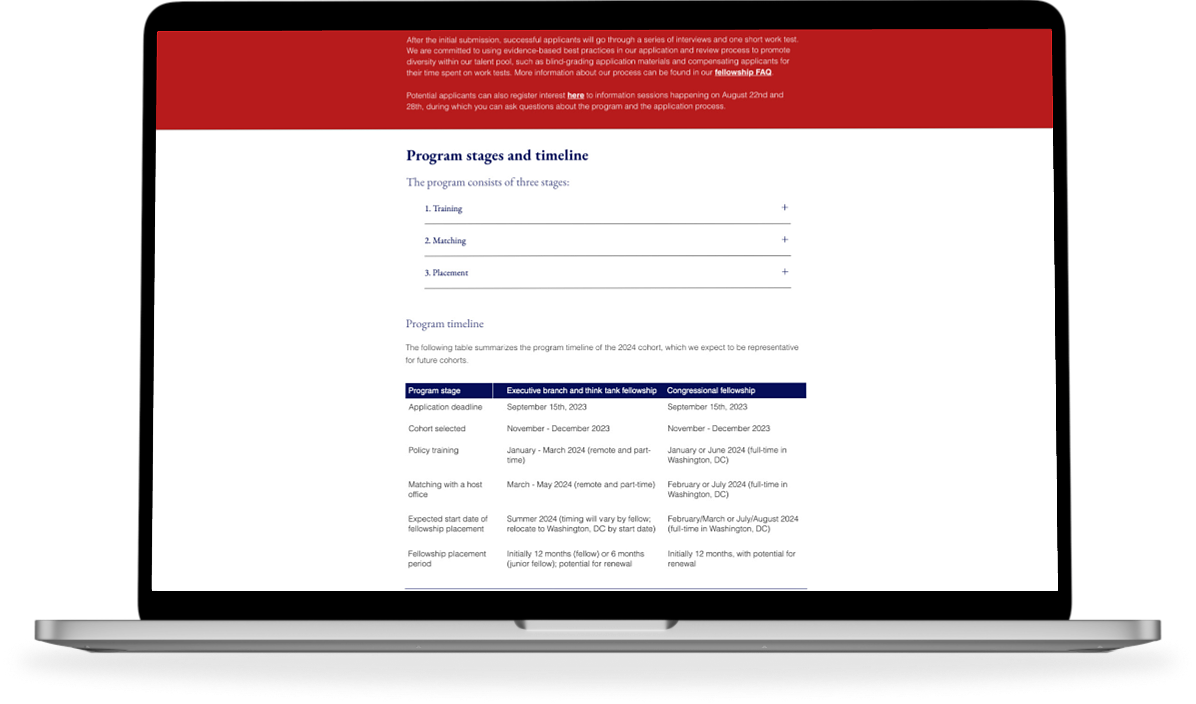
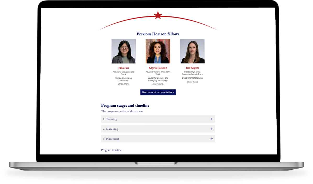
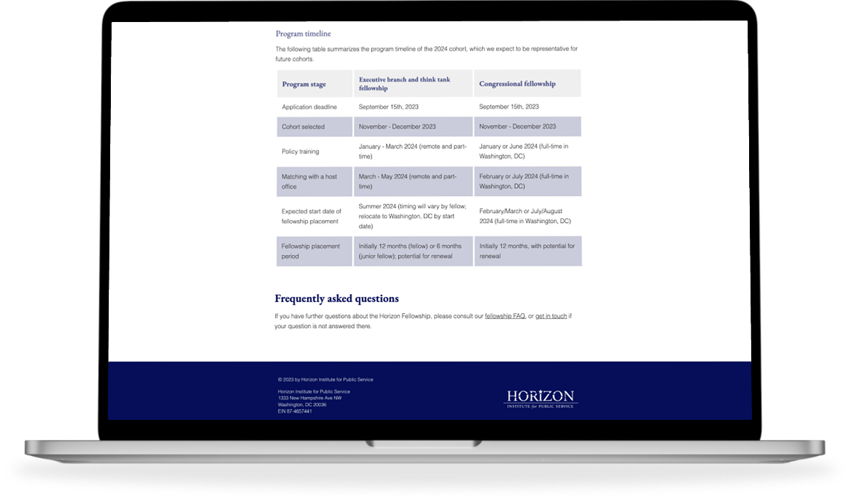
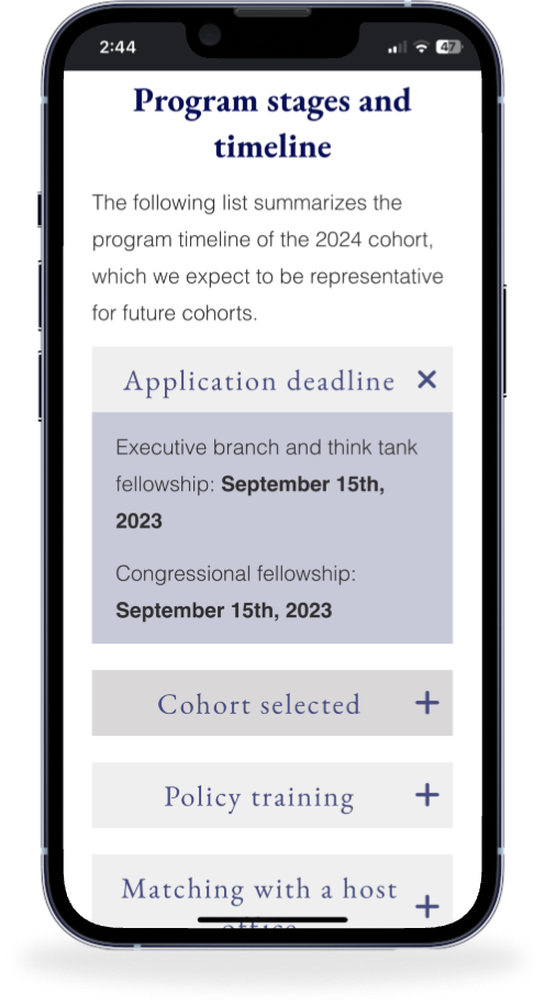
I changed the design of the table under "Program stages and timeline" and on mobile, it becomes an accordion menu. The previous mobile design was still a table that you had to horizontally scroll through, which isn't the best user experience.